
Category: Analytics
How to Measure EV Charging Station Utilization
Utilization is not one number. How sampling frequency changes the result, why the unit is the socket, and what quietly breaks the series.
Table of Contents7
A charging station being in use right now tells you almost nothing. Utilization is not a state, it is a rate: how much of a given capacity was used over a given window. And the value of that rate depends heavily on how often you looked.
Most charging network decisions skip past this distinction. Someone arrives with a number — "the station was used this many times" — and nowhere is it written which capacity, which window, or which sampling method produced it. Put two networks' utilization side by side and you are usually comparing two measurement methods rather than two competitors.
A rate of what, exactly
Defining a rate means fixing the numerator and the denominator separately. On the charging side both are contested.
The unit is the socket, not the station. If two of a four-socket station's connectors are busy, is the station "in use"? A station-level measurement puts it in the same bucket as one with a single busy socket. Utilization is only meaningful per charge point; the station-level figure is an average of the sockets underneath it, not a measure in its own right.
The denominator is uptime, not calendar time. A socket that spends three days faulted does not have zero percent utilization — you have no measurement for those three days. Conflating the two makes the most broken network look like the emptiest one, which is the exact inverse of what you are trying to find.
Time-weighted utilization and session count answer different questions. One socket may be used twice a day for seven hours total; its neighbour twelve times for three. The first describes revenue potential, the second describes traffic. Collapsing both into a single "usage" number loses both.
Sampling frequency decides the answer
Socket status is an instantaneous value: available, in use, offline. Nobody hands you the history — you accumulate it by sampling. The consequence is simple and its effects are large: you cannot guarantee seeing any session shorter than your sampling interval.
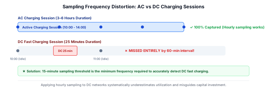
This creates a structural bias between AC and DC. An AC session usually runs three to eight hours, so hourly sampling catches it comfortably. A typical DC fast-charging session is twenty to thirty minutes, and hourly sampling misses a meaningful share of them. Apply one method to both and you systematically understate DC and flatter AC — which is precisely the wrong side of the investment decision.
Fifteen-minute sampling is not an arbitrary number for that reason: it is the first practical threshold below the shortest meaningful DC session. Sampling more often is better, sampling less often breaks the measurement. What matters as much as the frequency itself is that it stays fixed; in a series whose cadence changed midway, a trend and a method change are no longer separable.
Missed samples deserve the same discipline. An outage on the collection side cannot be closed by treating the interval as "available". The gap has to stay a gap and drop out of the denominator.
What should not count as utilization
Raw status data is not clean enough to convert straight into a utilization rate. Four items have to come out first.
Faults and offline time. If a socket is offline a third of the week, the finding is availability, not utilization. Kept as separate metrics, the pair also measures how well each network maintains its estate.
Occupied but not charging. A car left plugged in after the session has finished still reads as "in use" while no energy flows. This is exactly the situation an idle fee is written for. Where energy data exists this time belongs in its own field; where it does not, abnormally long sessions should at least be flagged.
Reserved status. A reservation is a demand signal, not usage. Counted as utilization, it makes capacity look tighter than it is.
Planned maintenance windows. Different from faults, usually announced, and they belong outside the measurement.
What quietly breaks the series
Most utilization series break through identity drift rather than method. These go unnoticed for months because the chart keeps looking reasonable.
Station identifiers changing. When an operator renumbers its estate, the old series silently attaches to a different station. Without cross-checking location and socket count, nothing surfaces it.
Socket count changing. Added capacity is a change in the denominator. Held constant, a station that gained two sockets suddenly looks emptier under identical demand.
Time zones and daylight saving. Peak-hour analysis is local. If data is not stored in UTC and localized at read time, the seasonal one-hour shifts blur the peak.
Source drift. For the same station, the operator's own app, a roaming platform, and a map app can each report different status. If the source is not pinned, a change of source looks like a change of station. This is the charging-side version of why one scraper is not enough.
What a well-measured rate answers
Once the method holds, the series answers three concrete questions. Is capacity sufficient at peak — does utilization press against one hundred percent and does demand turn away. Which connector is preferred — the gap between CCS and Type 2 sockets at the same station says what the next investment should be. Where does demand concentrate through the day — a site with an evening spike and one that runs flat all day are very different businesses at the same average.
All three only make sense read alongside price: is a busy station busy because it is cheap, or because there is no alternative. We covered comparing charging tariffs across networks separately.
From one station to a network
Watching one station by hand is possible. Watching a network is not. A hundred stations, three sockets on average, sampled every fifteen minutes, is roughly thirty thousand observations a day. At that scale utilization stops being something you check and becomes something you store: a dataset with a schema, a collection cadence, and a definition of "the same socket".
The engineering questions are the ones behind any structured collection. What defines the comparable unit, how often the window refreshes, and what happens when a source changes its interface. Because most of this data lives in mobile apps, that is where collection happens — the problem we describe under mobile app scraping.
Freshness matters most. A utilization series is only useful if it is continuous: a gap in the week demand jumps costs you the very pattern the series exists to show. That is why freshness belongs in a contract rather than on a roadmap — data freshness is an SLA.
Conclusion
A utilization rate is only as good as the definition behind it. Measured per socket, divided by uptime, sampled at a fixed cadence, with faults and idle time separated out, it supports a decision. Without those, it is a chart of your own collection errors.
Our EV charging stations usage data work is built on exactly these definitions. Status is the easy part; method is what makes the rate defensible.
Where this fits in the platform
Price Intelligence & Data Engineering
Emre writes about the machinery behind competitor price data: product matching, normalization, collection at scale and the analytics layer on top.
Contact Us
Leave your email address for a detailed demo or overview session, and we will get back to you shortly.